ShopDreamUp AI ArtDreamUp
Deviation Actions


Suggested Deviants


![[CS:GO] Classified ops](https://images-wixmp-ed30a86b8c4ca887773594c2.wixmp.com/f/548eb873-c3c3-4d54-beac-5e42e8eb82a7/d8o9jro-dee07090-d5e5-4fc4-9bfb-0fb39a351ad6.png/v1/crop/w_92,h_92,x_18,y_0,scl_0.079861111111111,q_70,strp/_cs_go__classified_ops_by_hidden_maverick_d8o9jro-92s.jpg?token=eyJ0eXAiOiJKV1QiLCJhbGciOiJIUzI1NiJ9.eyJzdWIiOiJ1cm46YXBwOjdlMGQxODg5ODIyNjQzNzNhNWYwZDQxNWVhMGQyNmUwIiwiaXNzIjoidXJuOmFwcDo3ZTBkMTg4OTgyMjY0MzczYTVmMGQ0MTVlYTBkMjZlMCIsIm9iaiI6W1t7ImhlaWdodCI6Ijw9MTE1MiIsInBhdGgiOiJcL2ZcLzU0OGViODczLWMzYzMtNGQ1NC1iZWFjLTVlNDJlOGViODJhN1wvZDhvOWpyby1kZWUwNzA5MC1kNWU1LTRmYzQtOWJmYi0wZmIzOWEzNTFhZDYucG5nIiwid2lkdGgiOiI8PTIwNDgifV1dLCJhdWQiOlsidXJuOnNlcnZpY2U6aW1hZ2Uub3BlcmF0aW9ucyJdfQ.B11eJbjK9vUnhZQqrUL1go5l6MgFvvcyoeoFZVAaQ1A)
Suggested Collections


You Might Like…


Featured in Groups


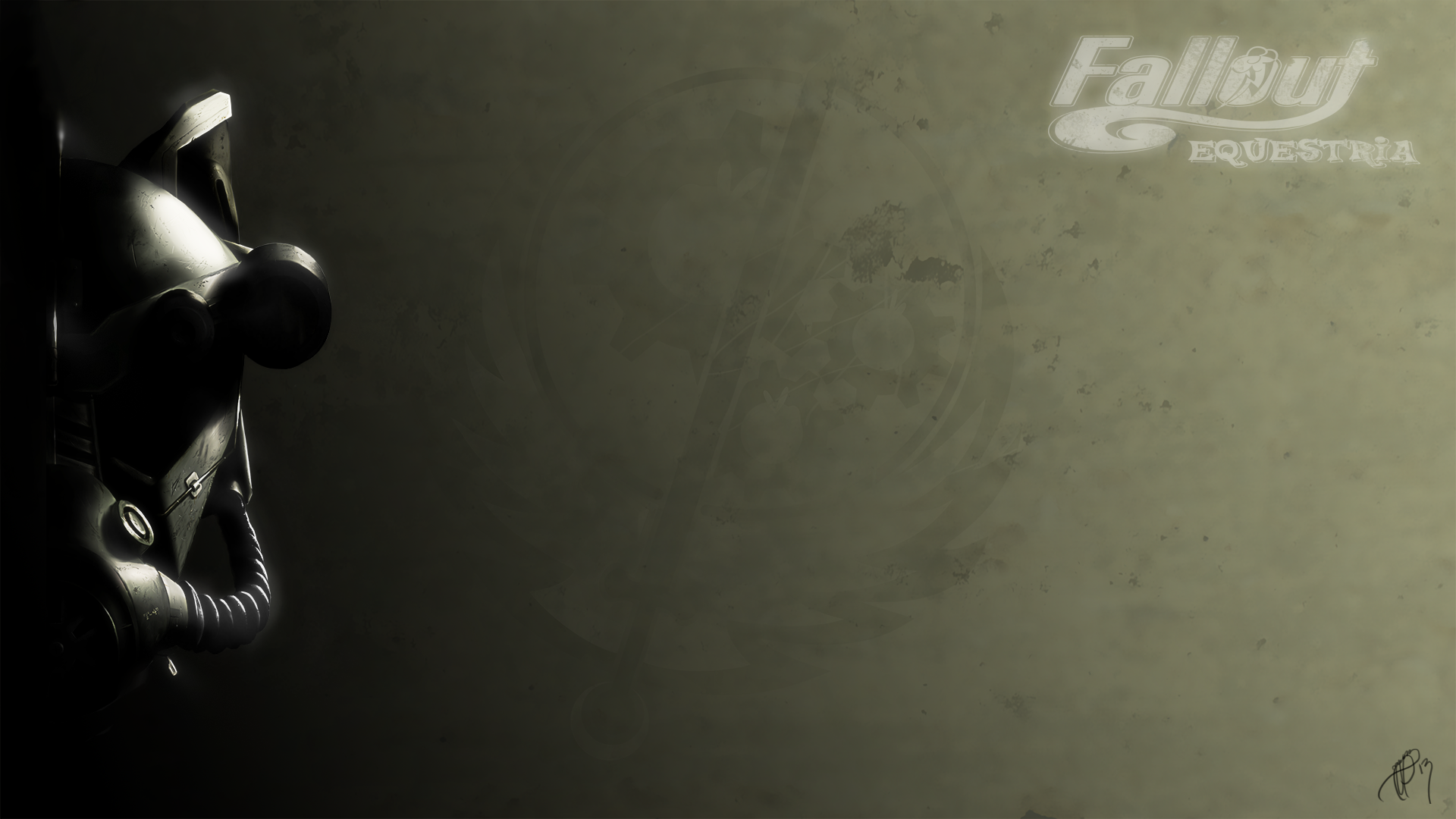
Description
Well... Yeah.
Do you honestly want to know where in the world this came from? Because in all honesty I want to know myself. This is the result of me picking up a tablet for the FIRST time. FIRST. Cross my heart, hope to fly, stick a cupcake in my eye!
I just... started drawing... And I got carried away...
I'm actually more spooked than proud I didn't know I could do this... But I digress...
This is actually a three parter series... Yeah, I got REAL carried away. But I hope you enjoy it. There was quite a bit of work that went into this... Dedicated to KKat for her amazing fiction, and all the side fictions and their authors that inspired me throughout this time...
Drawn in Paint Tool Sai. Mastered and touched up with GIMP 2.8
Fallout Equestria Logo by:
EDIT: Fixed that strange brush stroke on the eye socket. And increased glow, and added signature. (all originally intended, but for some reason, didn't export... Hmph.
RE-EDIT") rastic change by putting it through Photoshop. Increased contrast, grittyness, etc.
rastic change by putting it through Photoshop. Increased contrast, grittyness, etc.
------------
Fallout Equestria (c) Kkat
MLP:FIM (c) Hasbro inc.
Do you honestly want to know where in the world this came from? Because in all honesty I want to know myself. This is the result of me picking up a tablet for the FIRST time. FIRST. Cross my heart, hope to fly, stick a cupcake in my eye!
I just... started drawing... And I got carried away...
I'm actually more spooked than proud I didn't know I could do this... But I digress...
This is actually a three parter series... Yeah, I got REAL carried away. But I hope you enjoy it. There was quite a bit of work that went into this... Dedicated to KKat for her amazing fiction, and all the side fictions and their authors that inspired me throughout this time...
Drawn in Paint Tool Sai. Mastered and touched up with GIMP 2.8
Fallout Equestria Logo by:
EDIT: Fixed that strange brush stroke on the eye socket. And increased glow, and added signature. (all originally intended, but for some reason, didn't export... Hmph.
RE-EDIT
------------
Fallout Equestria (c) Kkat
MLP:FIM (c) Hasbro inc.
Image size
1920x1080px 1.52 MB
© 2013 - 2024 Brisineo
Comments29
Join the community to add your comment. Already a deviant? Log In
Wow. That about does it for the good. It's actually so good that I had to think about it for a good 20 minutes before I could find anything to point out that could be commented on.
The Good:
Overall the piece is a fabulous example of "less is more." There isn't a lot to distract the eye from the masterfully done mask. (Although that mask will make a comeback in the bad...) The shading and reflectivity is well rendered.
The Bad:
All I managed to come up with here is that the mask could show a little more wear to keep the feel of the post-apocalypse world. Scratches and dents, mostly. The Fallout: Equestria logo could also be just a tiny bit more visible. Maybe a slightly grey tint to it instead of the pure white on an ivory background.